Hand-painted pottery and engraved glass? – The Romans and Greeks
U-shapes, to communicate hierarchy? – The Anglo-Saxons
Frills, fanciness, and rows upon rows of silverware? – The Renaissance
Yes, we’re talking about table settings.
Creating the right table setting for the audience has been a key feature throughout time, and QSRs are no different.
Every single aspect of your QSR is a marketing tool – from the lighting, right down to the color of your flooring, napkin choice, and of course, your table layout. A well-designed floor plan can increase efficiency and flow, which enhances the customer experience, and keeps your diners safe and secure.
We’re uncovering the relationship between interior design and psychology and looking at the 5 essentials that every great QSR table layout needs.
How to choose a Restaurant Table Layout?
Although every restaurant is different, your table layout will form the blueprint for your interior design. It’s the first thing your customers will notice when they walk in – so it’s essential to get it right.
Some factors to consider include:
- Tables
- Chairs
- Machinery
- Walkways
- Trash/waste
- Amenities stations
You’ll need to consider each component’s size, color, style, and any state-wide regulations that could affect your choices.
No matter what design decisions you make, they should align with the purpose of your restaurant. Think about the dining experience you want your guests to enjoy and how you can meet their changing expectations.
Keep up with current ordering trends by designing a layout that gives you the scope and flexibility to implement new features. Mobile ordering is increasingly popular, so what about stations for delivery order collections? How about digital ordering touch screens or kiosks?
Why is having a great Restaurant Table Layout important?
Like everything else, table layouts in the food service industry have been hugely influenced by data. Recent studies reveal the science behind your interiors. Did you know that booth-style seating generates the highest spending per minute (SPM) of all table types?
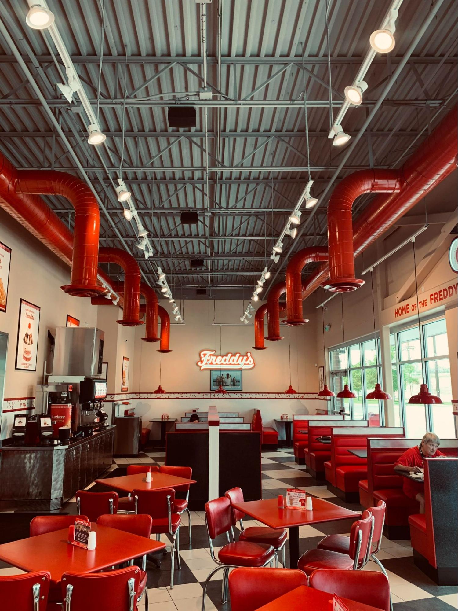
What does this actually mean? QSRs who want to increase revenue and improve marketability should turn to their tables.
Your layout and table choices can complement your branding strategy and improve your guest experience. A great layout improves ease of access, so your staff can get food out quicker, and you can welcome more customers through your doors.
5 Essentials for a Great Restaurant Table Layout
Your table layout directly impacts footfall and customer turnover, so your design needs to deliver high ROI by allowing your staff to work quickly. After all, QSR customers differ from your fine dining experience; they expect fast service, not the frills and fancies that establishments have had throughout history.
On a deeper level, a strategic interior design can tap into your customers’ behaviors and psychology. This allows you to influence their purchasing decisions through subtle choices such as color, material, and seat positioning. With this in mind, you’ll be confident investing in the right interiors for your QSR.
Here are 5 essentials that successful QSRs should take into consideration:
1. Accessibility and Safety
Regulations aren’t just a box-ticking exercise. They are vital for ensuring that your QSR is accessible to everyone.
Your seating area’s square footage can be determined by the size of your restaurant and regulatory requirements. A typical QSR should allow at least 18 square feet per diner with 36-inch spaces between main traffic tables. Let’s get measuring!
Adhering to these codes is the most important factor in your design choices. Aisles and traffic paths should be wide enough for customers, mobility equipment, and strollers to pass. At least 5% of your seating should be accessible, such as booths or fixed seating.
Designing your table layout with accessibility in mind helps ensure that your establishment is safe and welcoming for all customers.
2. Outline Each Space
Seats, sauces, and salt and pepper aren’t the only things your QSR needs. There’s another ‘S’ to think about: space.
There’s no right or wrong way to design your layout as long as it is safe and accessible. Typically the kitchen should take up 30-40% of your space, and the dining area should be 40-60%.
Practical elements will need your attention, such as placing restrooms near the kitchen to save money on plumbing costs. You’ll need to build your design around your existing interior restrictions, like columns, landlords, and zoning restrictions.
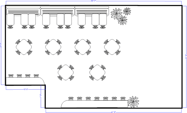
Sketching your floor plan helps you check that all interior elements create a coherent space, better workflow, and a great customer experience.
3. Think Like a Guest
There will always be ‘bad’ seating areas in a restaurant. No one wants to sit next to the restroom. Some people like to be by the door for fresh air, and others give you the side eye when you walk in and leave the door open. Although this is unavoidable, planning your layout with your guests in mind, helps you consider what will better their experience of your brand.
Every decision you make plays into your customers’ subconscious and affects the overall ambiance and experience of your establishment.. By better understanding their behavior, you’ll be able to create a design that influences their purchasing decisions and increases revenue.
Dining is a multi-sensory experience. Why not put yourself in your customers’ shoes by sitting in each chair and thinking about how your design might appeal to their senses?
You’ve already nailed taste, but what about sight, sound, smell, and touch?
Sight
Color psychology is a major consideration for QSRs. For example, green shows freshness, neutral colors are comforting and red makes you hungry! Whatever shades and hues you choose will trigger an emotional response from your customers. It will affect how they think about your food and help influence their feelings of ‘craving.’
As well as your color palette, lighting can influence customer behaviors and their perception of your business. Bright lighting is often found in QSRs because it symbolizes efficiency and helps your restaurant run optimally. In contrast, dim lighting encourages customers to stick around for longer.
Sound
The type of noise is just as important as the level of noise.
A high volume makes it difficult to hold conversations, so your customers are likely to leave more quickly. A study from 2011 suggested that loud background noise can suppress your diners’ tastebuds, that’s not good for anybody.
Although loud music can be off-putting, environments with noise levels similar to those in QSRs can encourage diners to stay longer and consume more food, increasing your average sale value.
Smell
When it comes to food, smell is one of the most influential senses. Have you ever been tempted into a cafe by the allure of freshly baked goods or pulled into a restaurant based on the aroma of fresh pizza?
Allowing the smell of popular or high-profit-margin items to waft into your restaurant can encourage customers to crave it and influence their purchasing decisions.
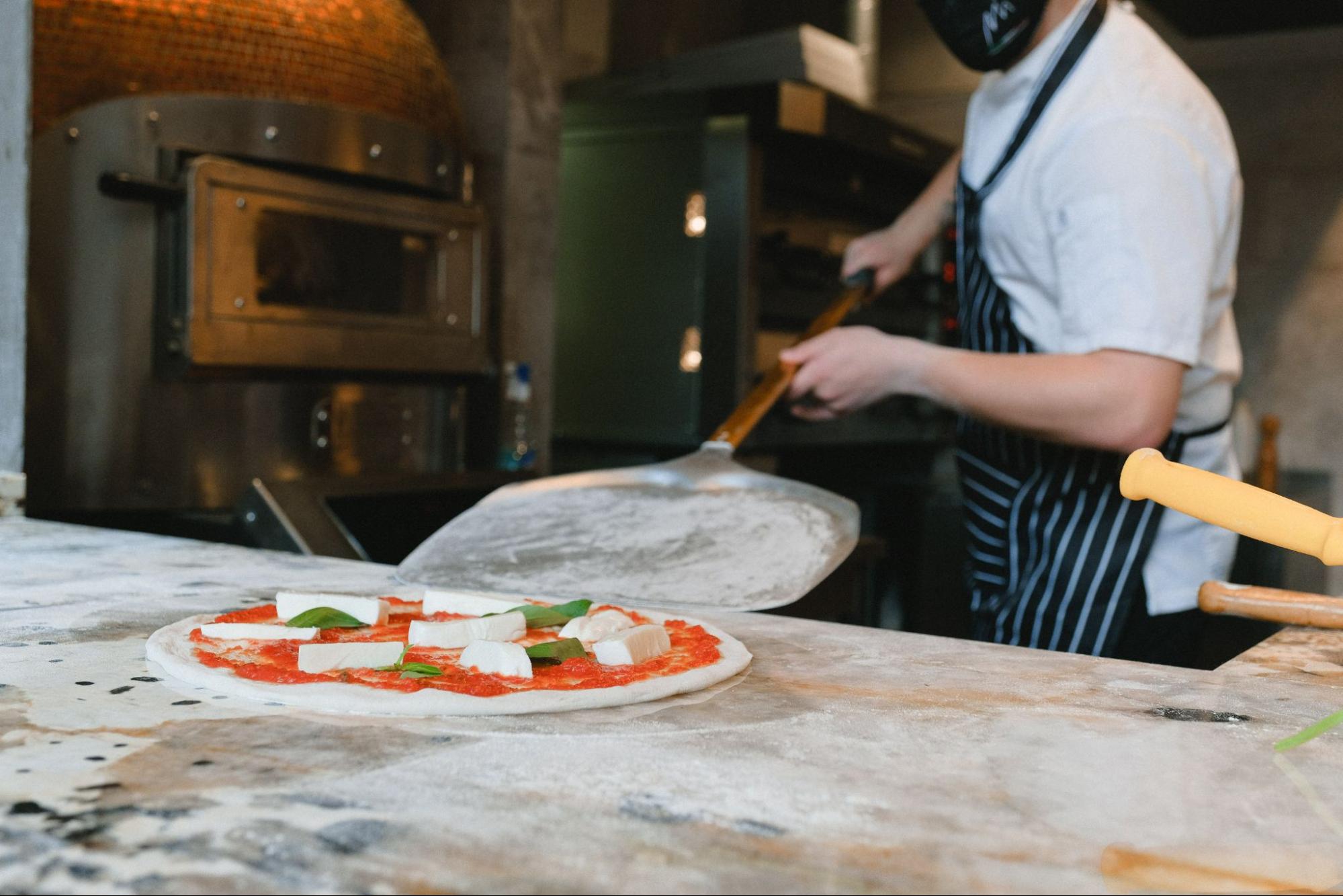
Smell also affects the perception of your QSR. For example, the smell of the food being created gives the impression that it is freshly made in-store.
Touch
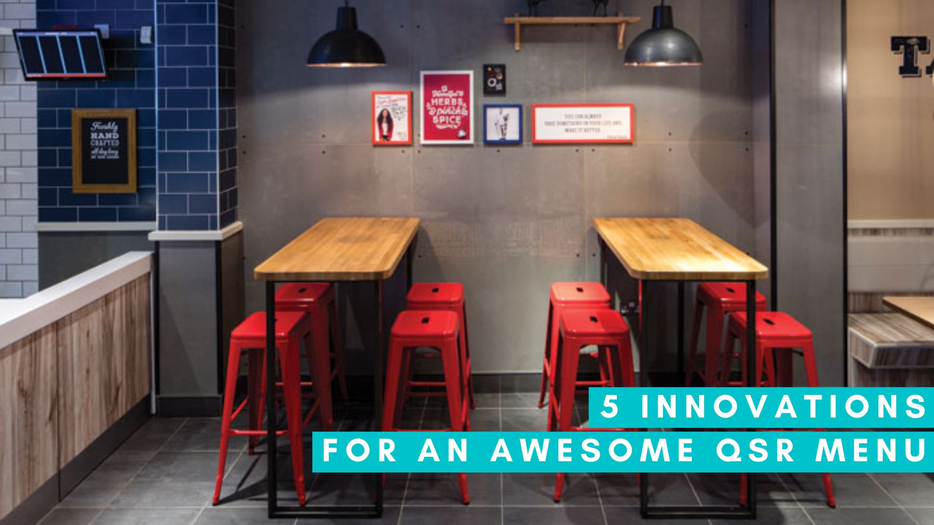
The quality of your tables, seats and other interiors should be practical and relative to the dining experience. For most fast food service restaurants, there’s no need to invest in plush seating and wooden furniture if you’re aiming for high customer turnover.
Instead, plastic might be better. You want your customers to be comfortable, but not too comfortable that they stay the night.
4. Don’t Forget Your Employees
Creating a great interior atmosphere for your customers is key, but so is designing a practical and safe layout for your employees.
Incorporating separate spaces and entrances for your staff helps prevent traffic jams when you’re busy. These areas don’t need to be expensive, large, or fancy. Locker rooms, breakout rooms, and offices provide your staff with privacy and safety, which will let them recoup and keep them happy.
5. Utilize all the space
Restaurants that have access to outdoor space should make the most of it.
Remember: Adding an outdoor seating area still requires the same planning, preparation, and regulatory consideration as indoor areas do.
Outdoor areas can present extra challenges: will you need overhead protection? Do you need fencing to separate your space from a car park or road? How close to the tables should you position any greenery?
From a branding perspective, continuing the same designs and color schemes helps create a feeling of consistency. But outdoor spaces might require other elements, such as fencing, umbrellas, or a patio.
Design a great customer experience
Rome wasn’t built in a day. Creating the perfect table layout for your establishment takes time and experimentation. You can’t go wrong with the 5 tips above. On top of creating the best space, why not revert to technology to further increase sales and experience?
Technology like digital menus and AI can help you further improve your customer turnover and revenue. With Hi Auto, you can be confident you’re reducing time in line and increasing the speed of service outside your restaurant inside and out.
Our conversational AI integrates with your PoS system to greet customers, take orders and upsell at the drive-thru. Find out more about optimizing your operations and increasing revenue with Hi Auto.

